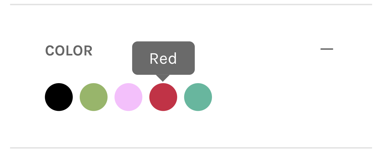
Adding tooltips to color filter options helps customers understand color names and variations more clearly. When hovering over color swatches displays descriptive text, you help reduce confusion about color identification and tend to improve filter accuracy, which supports better product discovery and enhanced conversion rates through clearer color communication.
Tooltip functionality enhances filter usability by providing contextual information without cluttering the interface. This helps improve customer confidence in filter selections and reduces returns from color mismatches, supporting better overall shopping experiences and improved conversion through clearer product attribute communication.
#2. Requirements
First, Color Mapping has to be set up. You can use this article:
https://developers.findify.io/docs/color-mapping
.
#3. Time Estimates
Set up in Platform: n/a hours
Integration: 0.5 hour
Styling: 0.5 hour
#4. Functional Overview
Components:[components/ColorFacet/content.tsx] https://github.com/findify/findify-js/blob/develop/packages/react-components/src/components/ColorFacet/content.tsx
#5. Integration Steps
To add a tooltip to color facet values you will need to tweak the colorFacet/content.tsx component. After the set up is finished, you can style it up to your wishes/needs. Here is the example of how to implement the tooltip with some basic styling.
All have to do is adjust the return statement to include:
components/ColorFacet
/** * @module components /ColorFacet */import { memo } from 'react';import cx from 'classnames';import { IFacetValue, MJSConfiguration } from 'types';/** * Defines if color is light or dark * @param hex Color Hex value */const checkIfLight = (hex) => { const _hex = hex.replace('#', ''); const str = _hex.length < 6 ? _hex + _hex : _hex; const number = Number.parseInt(str, 16); const red = number >> 16; const green = (number >> 8) & 255; const blue = number & 255; return (red * 299 + green * 587 + blue * 114) / 1000 > 220;};/** * Used to retrieve CSS styles for each facet * @param item Facet value * @param config MJS configuration to pull mapping from */const getStyles = (value: string, config: MJSConfiguration) => { const background = config.getIn(['colorMapping', value], value); const isLight = background === 'white' || (background.startsWith('#') && checkIfLight(background)); return { ball: { background: background.startsWith('http') ? `transparent url(${background})` : background, color: isLight ? 'black' : 'white', }, border: { borderColor: isLight ? '#C6C6C6' : 'transparent', }, };};export default memo(({ item, config, theme, children, isMobile }) => { const value = item.get('value'); const styles = getStyles(value, config); return ( <a style={styles.ball} className={cx(theme.ball, { [theme.ballMobile]: isMobile, })} > <span style={styles.border} /> <div className='findify-color-facet-value-tooltip' >{item.get('value')}</div> {children} </a> );});
css
.findify-color-facet-value-tooltip { position: absolute; bottom: auto; left: 50%; top: -45px; transform: translate(-50%,15px); border-radius: 4px; color: #fff; font-size: 12px; padding: .5em 1em; white-space: nowrap; margin-bottom: 11px; background-color: hsla(0,0%,7%,.9); text-transform: capitalize; transition: transform, opacity .3s; opacity: 0;}.findify-color-facet-value-tooltip:after { content: " "; position: absolute; border-left: 5px solid transparent; border-right: 5px solid transparent; border-bottom: 5px solid hsla(0,0%,7%,.9); top: 24px; left: 50%; margin-left: -5px; transform: rotate(180deg);}.findify-components--color-facet__item:hover .findify-color-facet-value-tooltip { opacity: .7;}
#6. MJS Version
This module has been optimized for MJS version 7.1.37