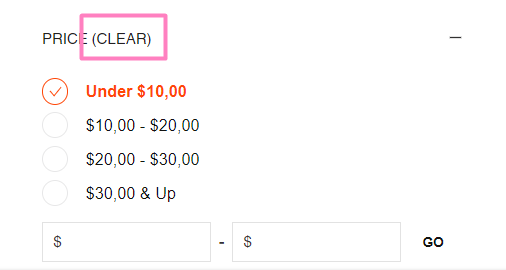
Adding a clear filters button helps customers easily reset their search refinements and start fresh explorations. When shoppers can quickly remove all applied filters with a single action, you reduce frustration from over-filtering and help improve product discovery by enabling easier experimentation with different search combinations, which tends to enhance engagement and conversion rates.
Filter reset functionality supports better search experiences by giving customers control over their refinement journey. This helps prevent dead-end searches and enables shoppers to pivot their product exploration efficiently, supporting better overall engagement and conversion through more flexible search interaction patterns.
#2. Requirements
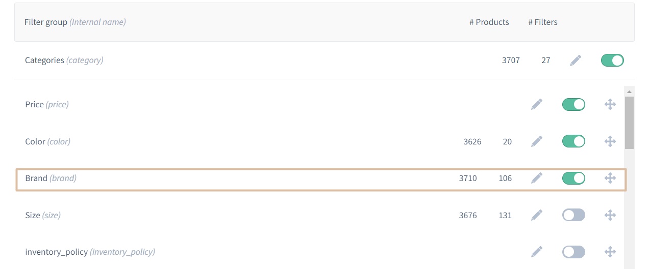
Merchant Dashboard SettingsFor this module to work, you will have to update a few settings in your Dashboard.
Filter Settings
You have to activate the filter in MD. We'll use the "Brand" filter as an example.
#3. Time Estimates
Set up in Platform: n/a
Integration: 0.5 hour
Styling: 0.5 hour (optional)
#4. Functional Overview
Components:[components/Facet/index.ts] https://github.com/findify/findify-js/blob/develop/packages/react-components/src/components/Facet/index.tsx
#5. Integration Steps
Within our filters you can add a button that will clear all checked items only for a specific filter at a time.
To do this:
- Import useFacets to components/Facet/index.tsx
- Create onReset method in components/Facet/index.tsx
components/Facet
import { useFacets } from '@findify /react-connect';import { useCallback } from 'react';const { update } = useFacets<Immutable.SearchConfig>();// default code const onReset = useCallback(() => { update('filters', f => f && f.delete(item.get('name')));}, []);
Having done that, you need to create the button in components/Facet/view.tsx and add the onReset method to be called on click.
components/Facet
<span display-if={selectedItemsCount > 0 } onClick={onReset} class="findify-clear-checkbox">(Clear)</span>
Final version
components/Facet
/** * @module components /Facet */// default code import { useCallback, useEffect, useMemo, useRef } from 'react';import { useFacets } from '@findify /react-connect';/** Props that Facet view accepts */// default code export default ({ theme = styles, item, config: _config, isMobile, isHorizontal, onToggle, openFacets,}: IFacetProps) => { const { update } = useFacets<Immutable.SearchConfig>(); // default code const onReset = useCallback(() => { update('filters', f => f && f.delete(item.get('name'))); }, []); // default code return ( <div className={cx(theme.root, { [theme.horizontal]: isHorizontal, [theme.mobile]: isMobile, [theme.expanded]: isOpen, })} > <Button className={theme.title} onClick={onClick} aria-expanded={isOpen} aria-controls={`facet-${item.get('name')}`} tabIndex={0} > <Text primary uppercase className={theme.text}> {title} <span display-if={selectedItemsCount > 0 } onClick={onReset} class="findify-clear-checkbox">(Clear)</span> </Text> <Icon name={isOpen ? 'Minus' : 'Plus'} className={theme.icon} title={isOpen ? 'Collapse list' : 'Expand list'} /> </Button> <div className={theme.body} hidden={!isOpen}> <Component facet={item} config={config} isMobile={isMobile} /> </div> </div> );};
#6. MJS Version
This module has been optimized for MJS version 7.1.37