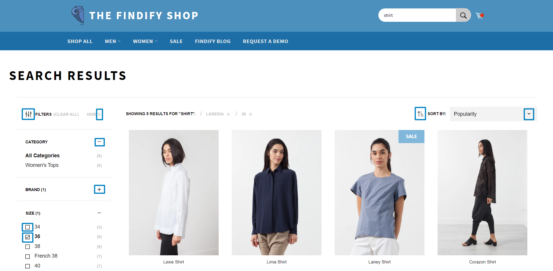
You can customize icons throughout your search and merchandising interface to maintain brand consistency and improve user experience. When your filter controls, navigation elements, and interactive components use on-brand iconography, you create more cohesive shopping experiences that help customers navigate product discovery more intuitively, which tends to enhance engagement and conversion rates.
Custom icon implementation enables you to align visual elements with your brand identity while maintaining clear functionality. This helps ensure that customers can easily understand and interact with search filters, sorting options, and navigation controls, supporting better product discovery and a more polished shopping experience.
Warning!If you want to modify default icons (plus, minus signs, arrows etc.), you should not change the default components in the components/Icons/ path, instead, you need to create a new component with custom icons.

Generally, there are multiple ways to create custom icons. Let's create a new component called 'CustomIcons.tsx' and here is how we can code new custom icons:
CustomIcons.tsx
import React from 'react';export const SomeCustomIcon1 = (props) => ( <svg className='some_class_name'> ... </svg>);export const SomeCustomIcon2 = (props) => ( <svg className='some_class_name'> ... </svg>);export const SomeCustomIcon3 = (props) => ( <svg className='some_class_name'> ... </svg>);
And then you will be able to use these icons in any other component like that:
Some component
...some imports here...import { SomeCustomIcon1, SomeCustomIcon2, ...more icons if needed } from 'CustomIcons.tsx'; // import newly created file with custom icons ...some code here...<SomeCustomIcon1 props={props} /> //Here is how you can use an icon...some code here