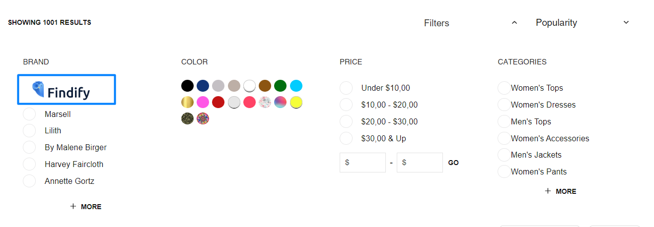
You can replace text-based filter labels with images to create more visual and intuitive filter interfaces. When filter options display as images rather than text - particularly useful for attributes like colors, patterns, or styles - customers can make refinement choices more quickly and confidently, which helps improve search efficiency and tends to enhance conversion rates through clearer visual communication.
Visual filter options reduce cognitive load and enable faster decision-making during product refinement. This helps improve product discovery by making filter choices immediately recognizable, supporting better conversion through more intuitive search interactions that align with how customers naturally evaluate visual product attributes.
Components:[components/common/Checkbox/index.tsx] https://github.com/findify/findify-js/blob/develop/packages/react-components/src/components/common/Checkbox/index.tsx
Here the idea is to adjust the Checkbox component to show images instead of names in the filters.
First, you need to create an array, where images will be added for each filter value.
components/common/Checkbox/index.tsx
const designImages = { '<DESIGN>': '<LINK TO IMAGE>', '<DESIGN 2>': '<LINK TO IMAGE>'};
Then you need to write a condition, which will remove the checkbox icons for this specific filter.
And then change text to an image, like this
components/common/Checkbox/index.tsx
<Text primary lowercase className={theme.content} bold={isSelected}> { designImages[content({ item, config })] ? <img src={designImages[content({ item })]} /> : content({ item, config }) }</Text>
Final version
components/common/Checkbox/index.tsx
/** * @module components /CheckboxFacet */// default code const designImages = { 'Hannes Roether': 'https://files.readme.io/11e6988-Final_Logo.White_BG_1.png'};export default ({ item, theme = styles, style, onItemClick, content, config, isMobile,}: ICheckboxFacetItemProps) => { // default code return ( <Button style={style} role="checkbox" aria-checked={isSelected ? 'true' : 'false'} tabIndex={0} onClick={onClick} className={cx(theme.item, isMobile && theme.mobile)} > // we use span instead of Icon in this case <span className={isSelected?"findify-checkbox findify-checkbox-selected":"findify-checkbox"} display-if={!designImages[content({ item, config })]}> </span> <Text primary lowercase className={theme.content} bold={isSelected}> { designImages[content({ item, config })] ? <img src={designImages[content({ item })]} /> : content({ item, config }) } </Text> </Button> );};