OVERVIEW
In this release, we are happy to announce the launch of two very exciting enhancements – the redesigned email campaign reports and the ability to see why a contact was added to the DNM list.
To learn more, read on!
ENHANCEMENTS
Redesigned Campaign Reports
The email campaign report now boasts of an enhanced design and here are the highlights:
- Better look-and-feel for a superior user experience.
- Responsive design to provide you with a consistent experience across all devices.
- Clearly labeled and logically organized information to make the report data more accessible and comprehensible.
To learn about email campaign reports, see Email Campaign Reports.

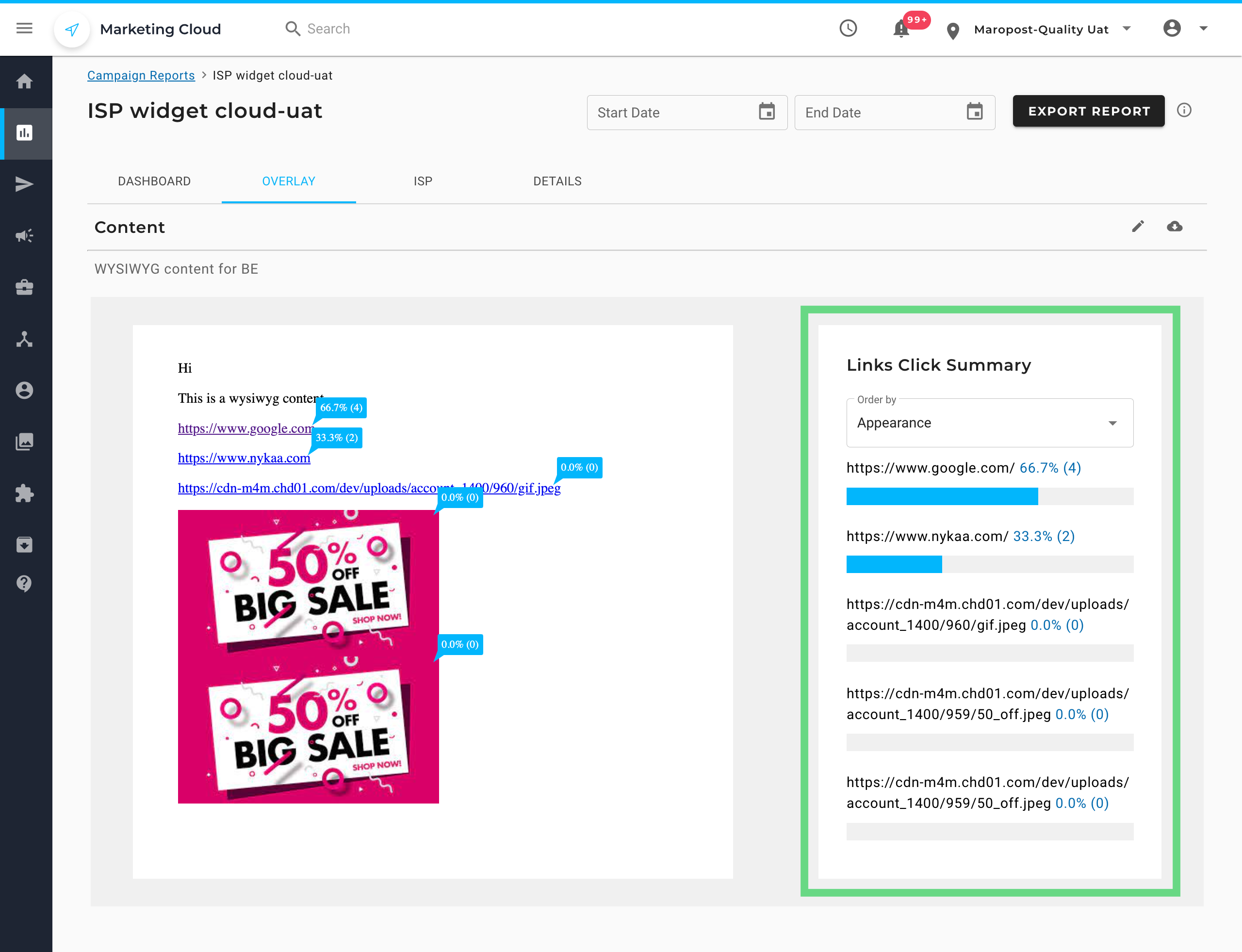
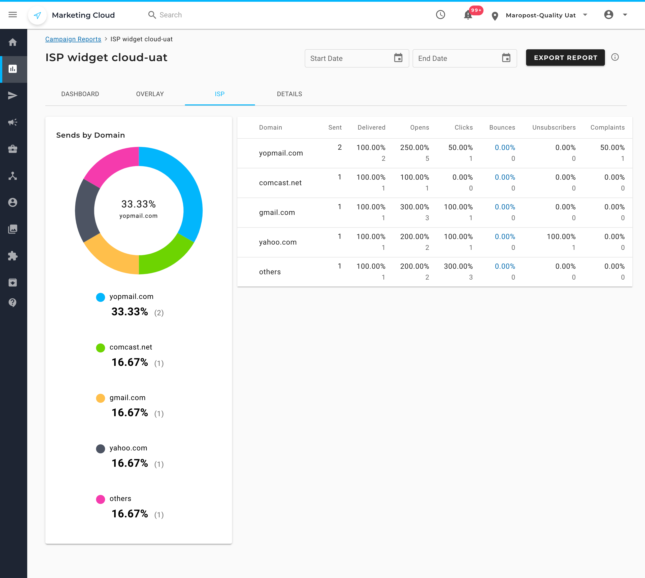
While the report data mostly remains the same, you’ll notice the following changes:
- The Click map Overlay includes a new chart displaying the links click summary, which can be sorted based on the order of appearance in email, most clicked, and least clicked.
- The ISP Report now highlights percentage-based data.
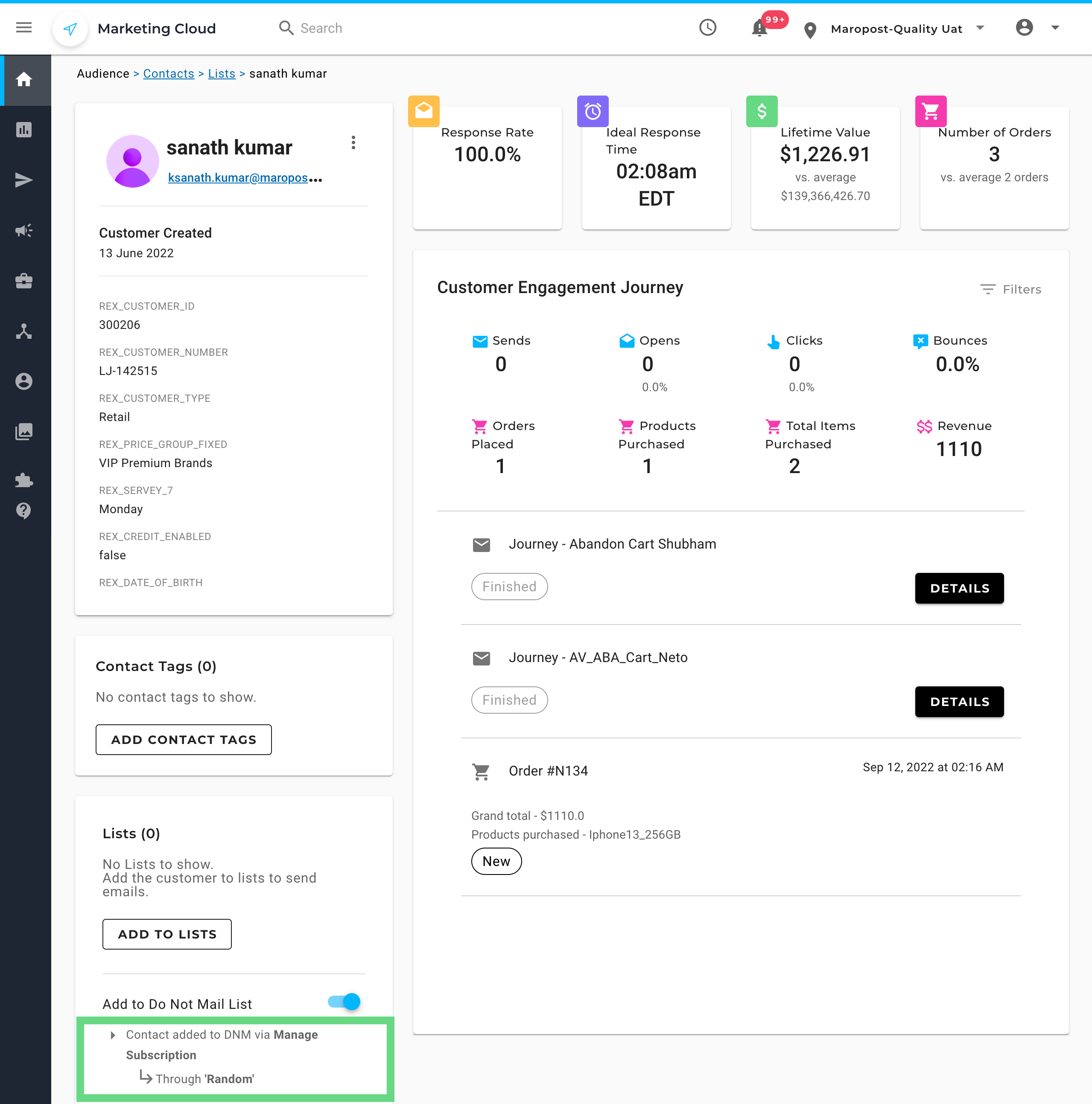
Find Out How a Contact got Added to the DNM List
If you ever wondered if there was a way to find out how a contact ended up being added to the Do Not Mail (DNM) list, then we have some good news for you! We now display the reason/action by which a contact was added to the DNM list.
On the Contact Overview page, scroll down to the Lists section. Here, under the Add to Do Not Mail List toggle, you can see the reason the contact was added to the DNM list. To learn more about contact overview, see Viewing a Contact Overview.
The following is a screenshot of the Contact Overview page for a contact who was added to the DNM list by clicking the Manage Subscription link on a campaign.