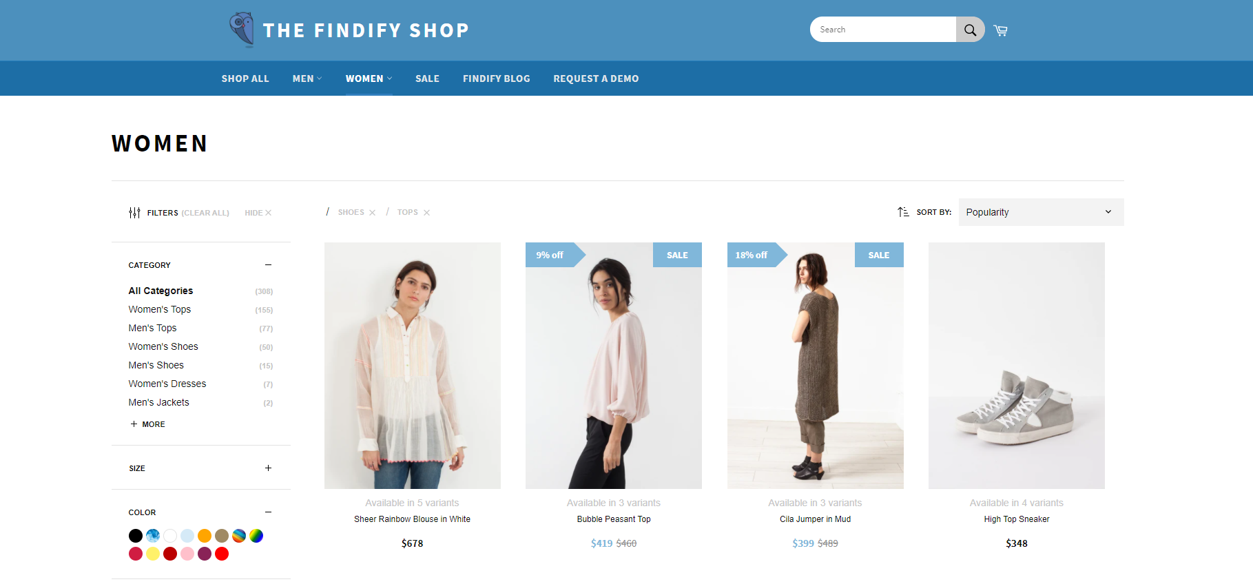
You can implement a fullscreen autocomplete design to create more engaging product discovery experiences, particularly effective for lifestyle and inspiration-driven categories. When autocomplete prominently displays trending products and search suggestions in a fullscreen format, customers can preview product options more effectively during search, which helps improve product discovery and tends to enhance conversion rates by building confidence before reaching search results.
Fullscreen autocomplete maximizes visual product presentation during the search phase, helping customers quickly assess whether their query will yield relevant results. This design approach is particularly valuable for fashion, beauty, and home decor categories where visual confirmation drives purchase decisions and helps reduce bounce rates from unsuccessful search attempts.
Fullscreen module of Autocomplete
#1. Background
Our frontend library is built for total control where all assets are fully customizable. Over the years we have however developed best practices and the purpose of this post is to share codes and instructions to easily utilize this best practice module.
The fullscreen Autocomplete is most commonly utilized by lifestyle related industries such as fashion, footwear and home interior, but task oriented merchants such as technology to showcase individual products.
#2. Requirements
In order to apply this module without customizations, there are a few things to keep in mind:
API Response
The default elements used in every autocomplete are:
- product image
- product title
- product price
Placement of The Search Input
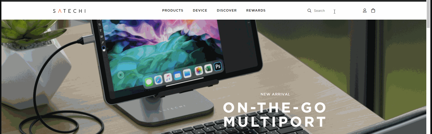
The search bar should be somewhere at the top of the page as in the example shown below:
Search bar displayed on top of the store
This is to prevent any styling issues that could happen if the search input would e.g. be in the vertical center of the page - like cutting off the bottom of the autocomplete in this specific case.
Behavior of The Search Input
This module is optimized for navigation bars that are not fixed to the top of a page. If fixated at the top, the autocomplete needs to be adjusted to follow the behavior of how the header is minimizing. This is done by transforming the position from relative to a fixed position tied to an object. This is done using Javascript and CSS with actual steps depending on overall layout.
What is a fixed navigation?
A fixed navigation is when you're scrolling on a page and the navigation always sticks to the top of the page. A navigation which is not fixed, will scroll with the page (and therefore not be visible at all times).
#3. Time Estimates
- Set up in Platform: 0. No actions outside our DevTools are required.
- Integration: 0.5 hour
- Styling: 0-2 hours (optional)
#4. Functional Overview
To apply the fullscreen autocomplete module, we need to adjust a component in the code. We have prepared some snippets that we will link below in the Integration Steps. To give you an overview, these are the components we are going to work with:
- components/Cards/Product/view.tsx
- components/autocomplete/ProductMatches/view.tsx
- layouts/Autocomplete/Dropdown/view.tsx
- styles
#5. Integration Steps
Each of the below steps links to a code snippet on GitHub:
- Remove the Autocomplete Tip
- Adjust the columns to display 4 products per row instead of 1
- Here is the styling to copy into the CSS file
- Adjust Thumbnail Sizes
👍 Image Sizes: The autocomplete is using thumbnail images, which need to be balanced between performance (small) and quality (large). Default thumbnail images tend to be too small.
For Shopify, Thumbnail images can be adjusted in the following way:
Replace the image url's "_small" value with e.g. "_medium"
The full module can be found here.
#6. Modifications
Fonts
By default, we are using the font family "Karla".
Here's a CSS snippet of our default source code:
CSS
:root { /* Fonts */ --font-base: 'Karla', sans-serif;}
If you want to alter the font family, you need to overwrite this default font family using the same pattern within our dev tools.
Below is an example of using a custom font-family. It is important to note that we can overwrite existing CSS using the same variable names or the same class names. In this case it's
CSS
:root {--font-base: some value;}
Or, using a real font family:
CSS
:root { --font-base: Helvetica,Arial,sans-serif;}
Colours
This module is using our default colour scheme that can be found throughout all components. Within the autocomplete, the applicable colour-assets would be:
- a grey tone (#c6c6c6) for "Trending Searches", "Trending Products", "Search Suggestions" and "Product Matches" titles
- a black tone (#111) for overall texts including regular prices
And for products on sale, the sale price would show in red (#d0284b), the old price in grey (#8d8d8d).
This can be adjusted using CSS through the our Devtools.
Image Aspect Ratio
By default, this Autocomplete Module presents four products and is responsive in height where it scales when the ratio of the images changes. For some ratios, this might require modifications to present an ideal experience.
Most common alterations:
- Cropping the images or locking one dimension (height/width) can be achieved by simple CSS.
- Horizontally oriented images are often best presented with fewer than four products.
- Vertically oriented images are often best presented with more than four products.
To change the number of products presented, you need to:
- In our Dashboard, update number of products generated for the Autocomplete
- Update the code with the following modification.
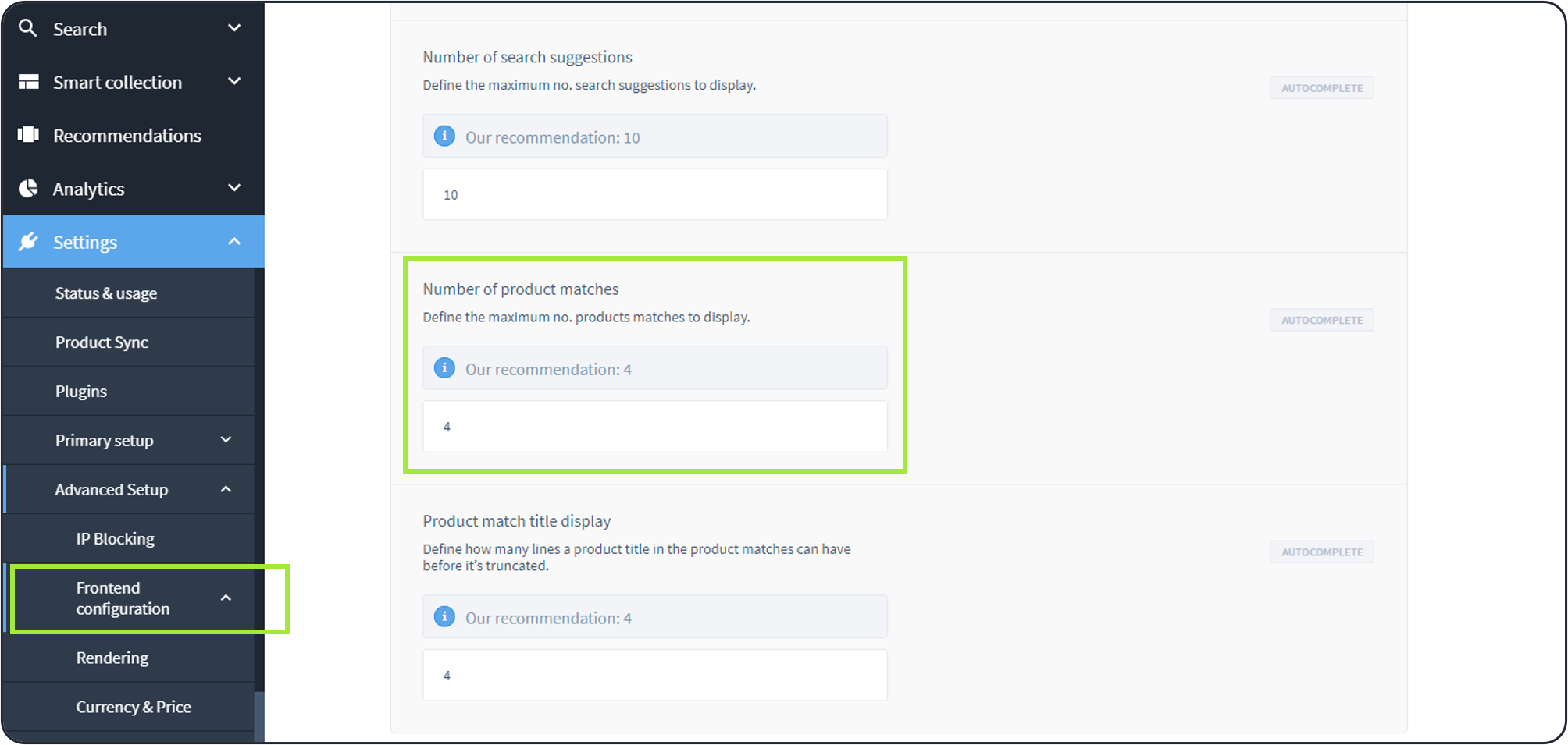
Frontend Configurations found in Dashboard > Settings > Advanced Setup > Frontend Configuratons
Adjusting the Breakpoint
This module is using styling that is specifically set to change styling for desktop versions only to prevent the mobile autocomplete module to grab up any styling that is not supposed to be used in there. By default, our system's breakpoint is set to 767px.
This can be adjusted in
- Our Dashboard
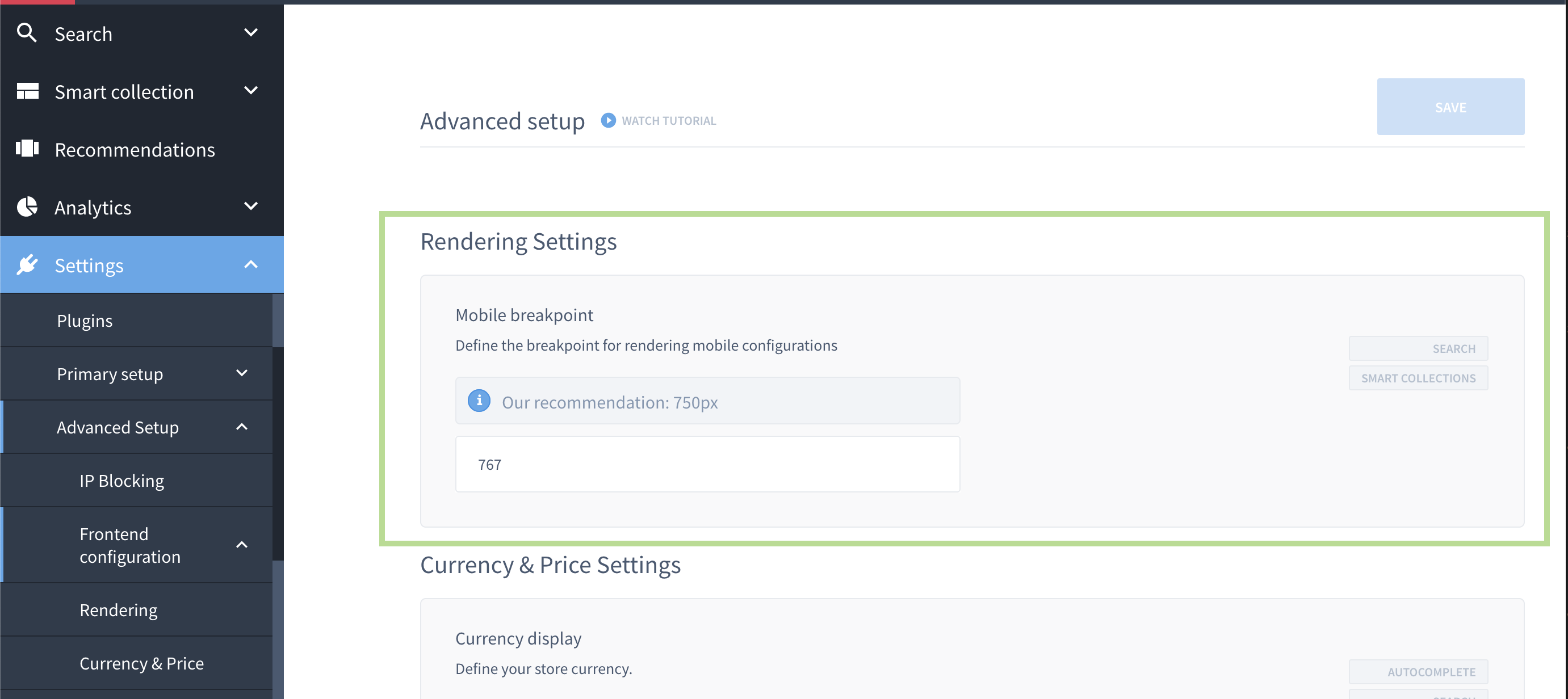
Frontend Configurations found in Dashboard > Settings > Advanced Setup > Frontend Configuratons
2. The CSS snippet by altering the min-width.
#7. MJS Version
This module has been optimized for MJS version 6.16.10
Related Articles
Search & Discovery:
Product Recommendations:
Conversion Optimization: